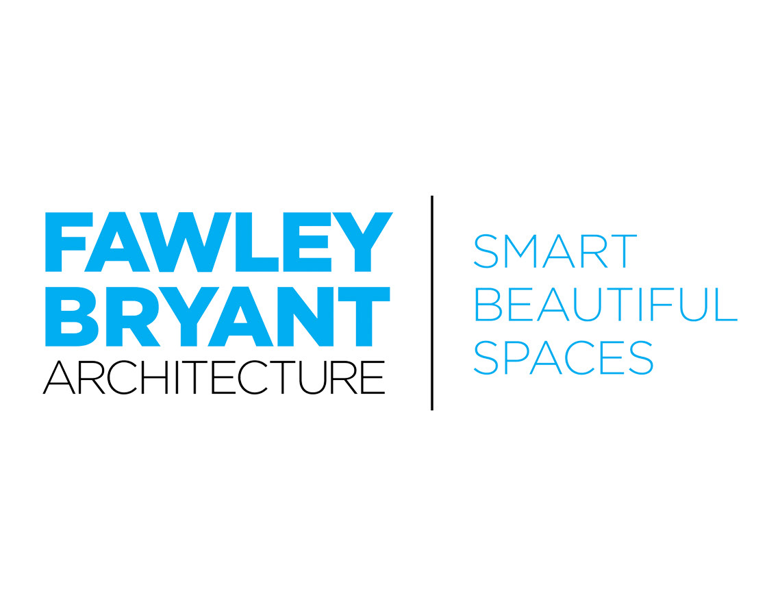
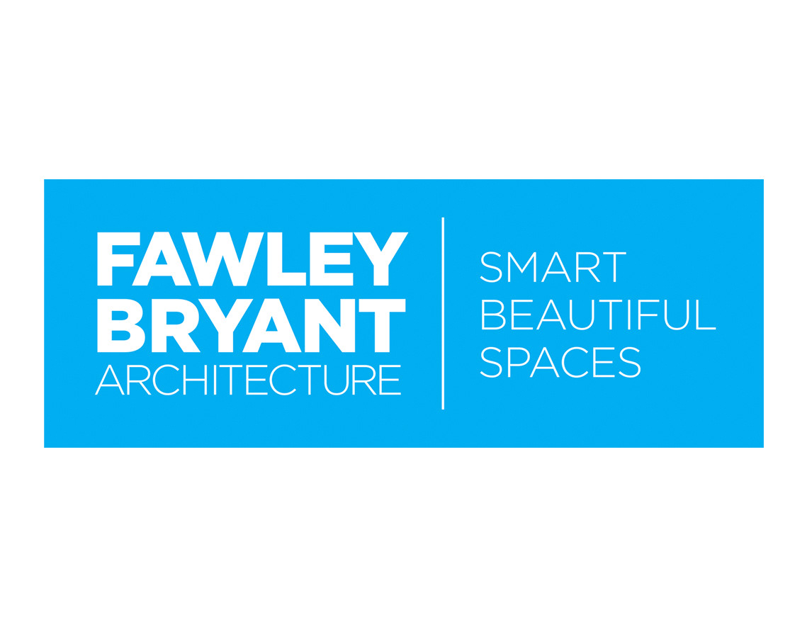
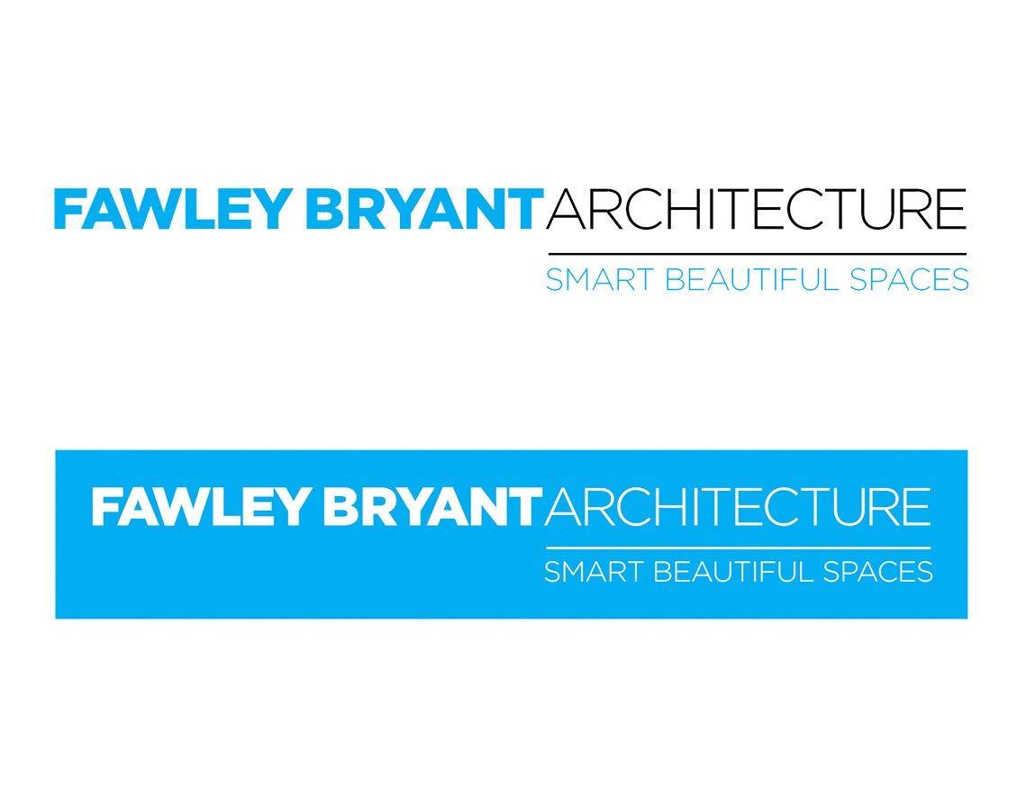
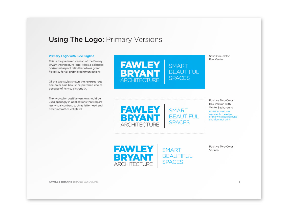
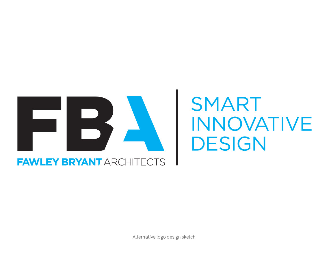
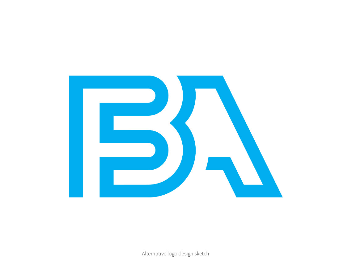
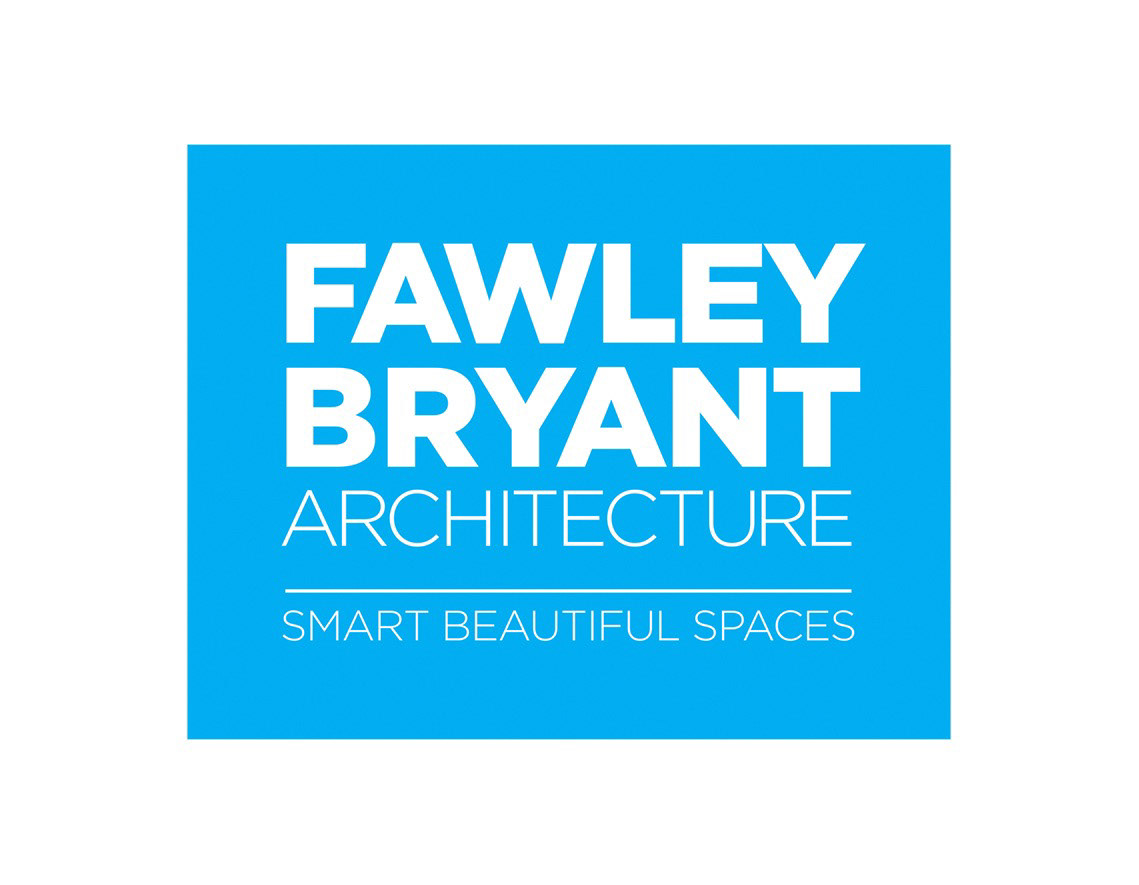
Fawley Bryant Architects, founded over 20 years ago by partners Richard Fawley and Michael Bryant, has experienced many changes and major growth in recent years. With the tragic loss of Rick Fawley, and the rise of younger architects to key partner positions, they felt it was time to redesign their logo to reflect the new direction and vision of the firm. Our initial sketches (the last 3 in the sequence) included shortening the full name to FBA, adding a new tag line, choosing a new color (bright blue) and graphic element (the square, representing a defined space) that would stand out in any application. Ultimately, the partners chose to keep the full name and the blue square, but to tweak the tagline to express their design approach of “smart, beautiful spaces”. We created several versions of the new logo for versatility: positive, negative, stacked, and extended. In addition, we developed a comprehensive “Logo Usage Guidelines” to ensure the visibility, consistency, and integrity of the logo wherever it may appear.