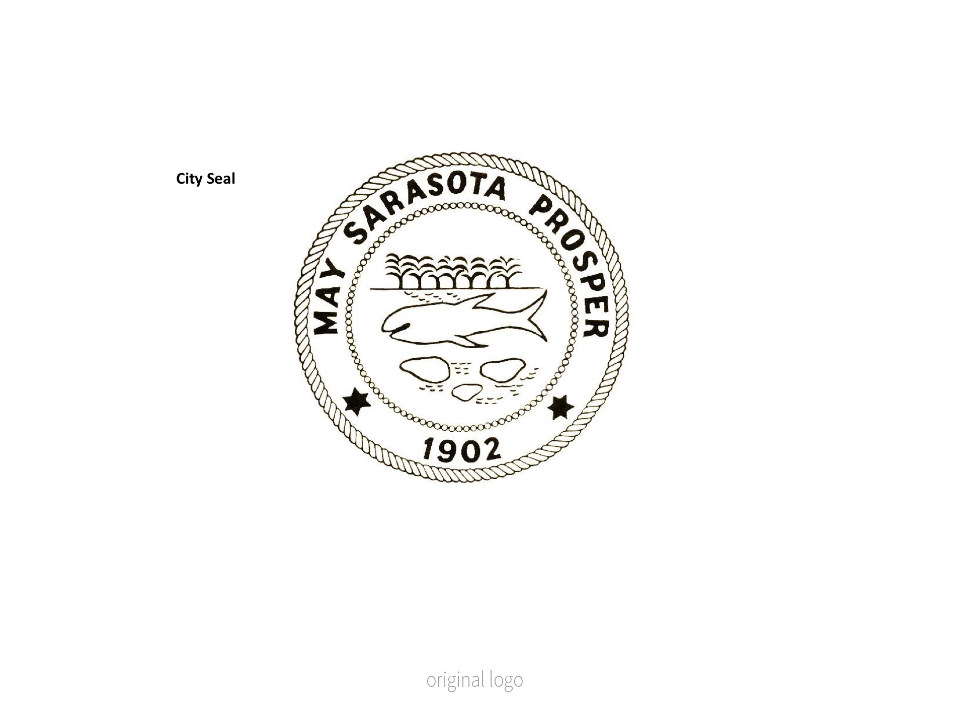
I was recently asked by a local agency to create a logo refresh for the two main logos for the City of Sarasota. The local agency recently ran a design competition to get the artist in the community to sketch their ideal logo for the Sarasota Seal only. Because Ringling School of Design is located on the outskirts of Downtown, there is not shortage of designers.
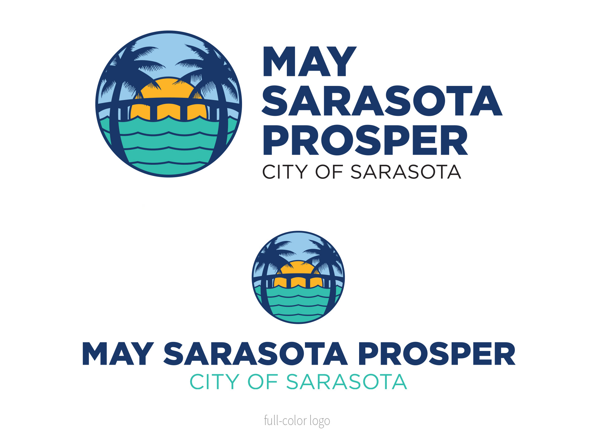
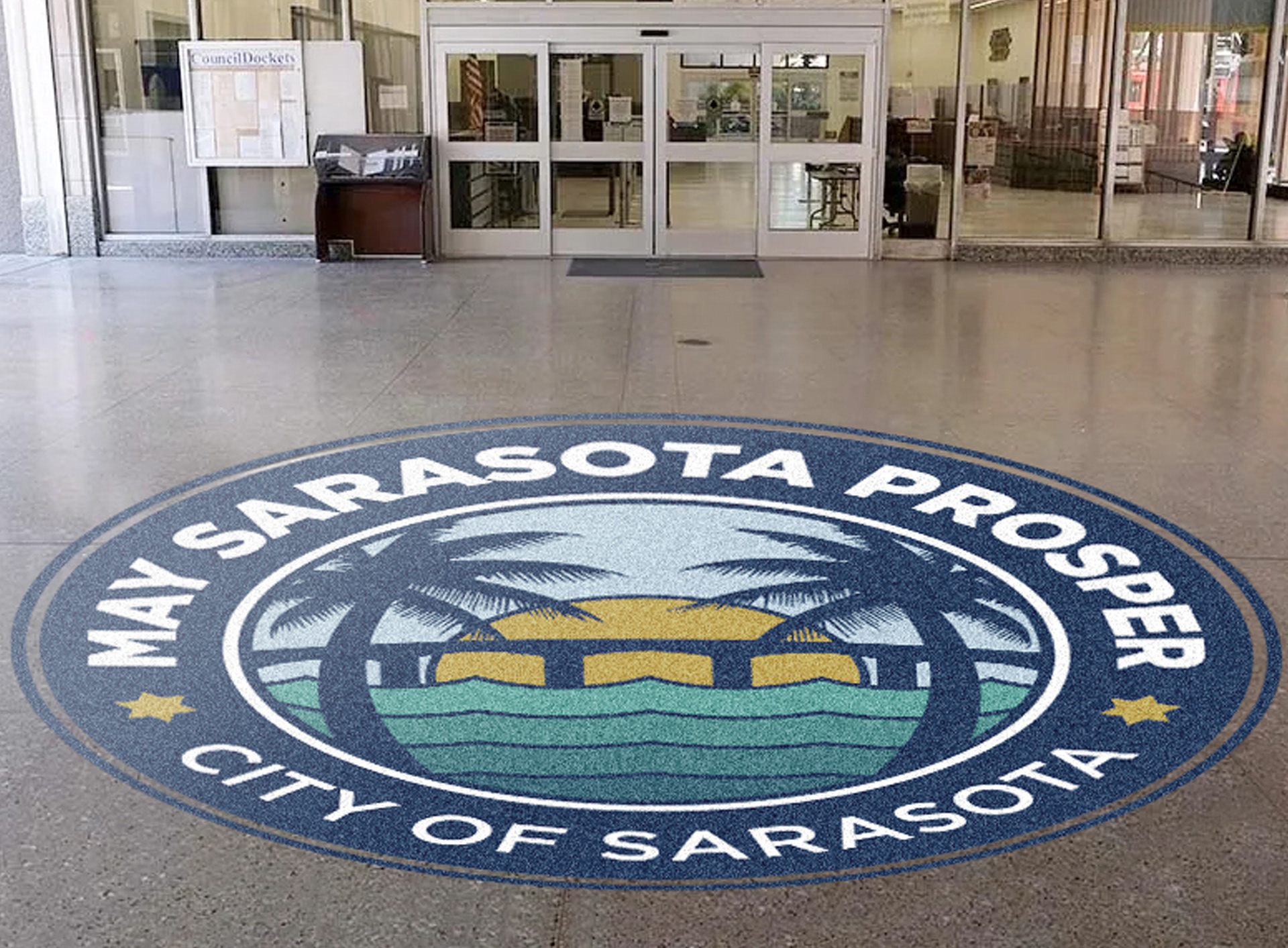
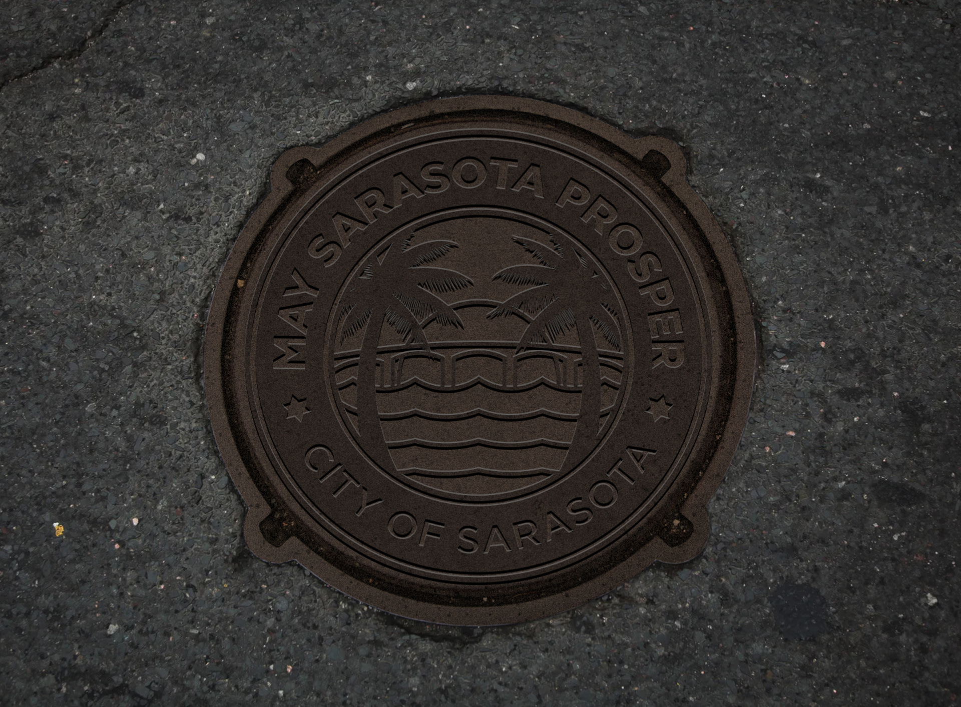
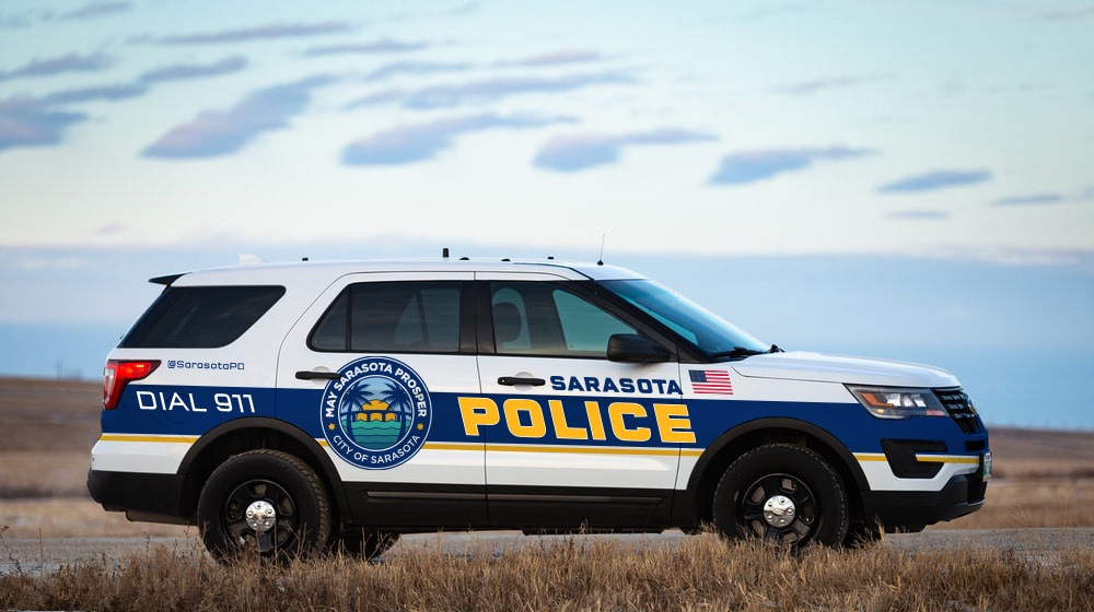
The seal was to contain the Ringling Bridge, water, 1 or 2 palms and a sun.
With the entries compiled, the committee provided their feedback and selected their 4 favorites. At this point they came to me to me to take all the feedback and come up with the new logo. It was a particularly strange way to create a creative brief but it did make the design process go faster. I came up with the first round of sketches pretty quick. We did get hung up on the palm trees. Apparently, there are a variety of palms and someone in the decision committee wanted only a native palm to the area. This process slowed the logo creation by a couple weeks. The palm native to Sarasota in illustration form is a bit fussy with too much detail. It was tough getting the correct palm to play nice with the rest of the simplistic elements.
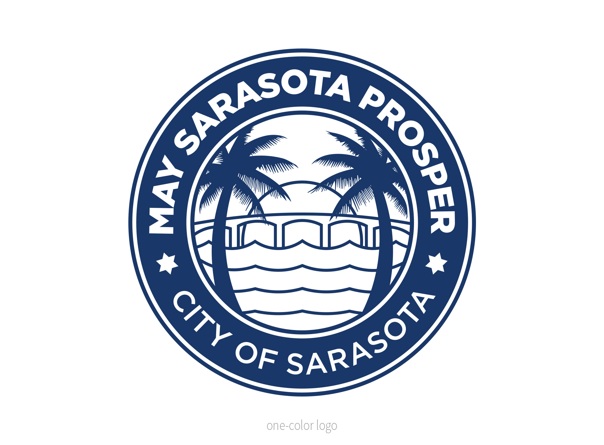
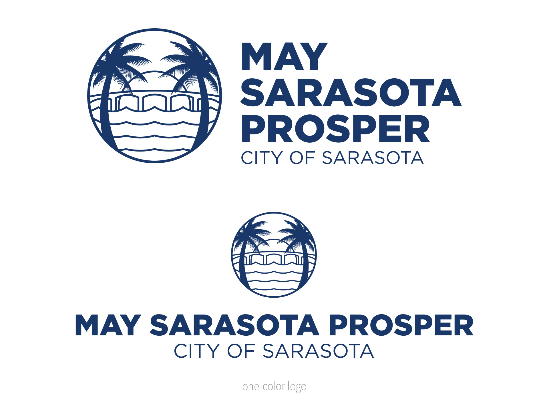
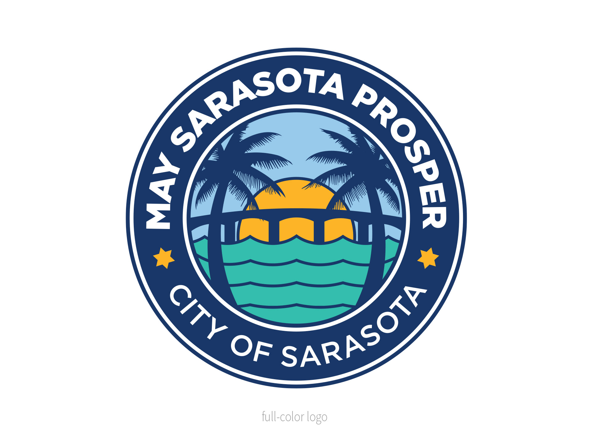
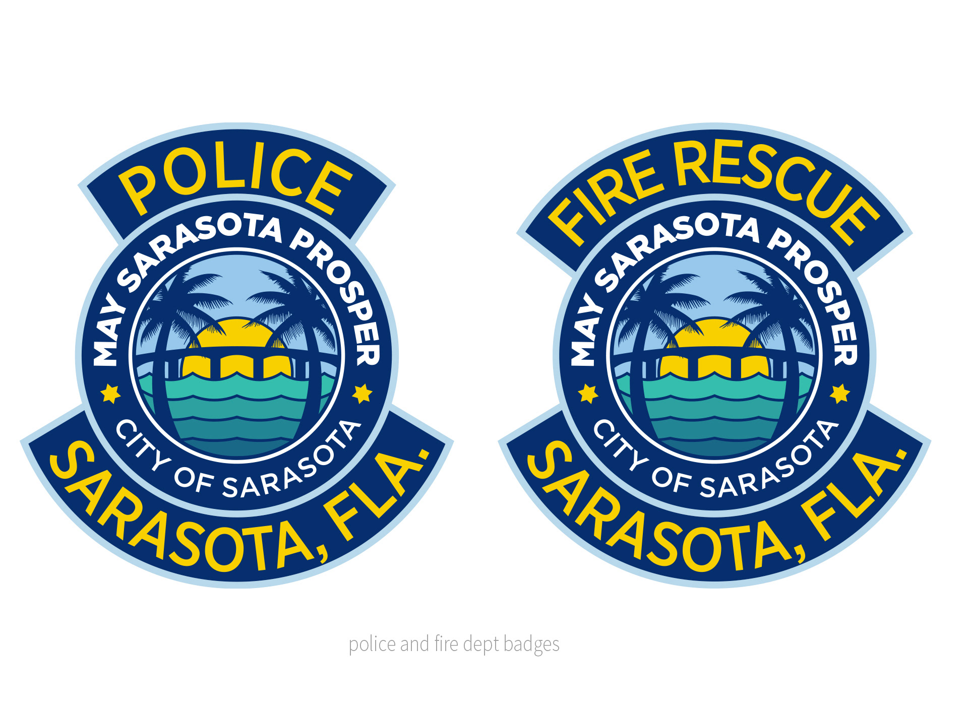
The final seal below is a bit odd because of the large motto text and not City of Sarasota, but the remaining city logo would have City of Sarasota. So, if both logos had City of Sarasota it could get confusing. One benefit I was able to create is the versatility of the seal. The center illustration was created to be usable without the text ring if size and readability became an issue.
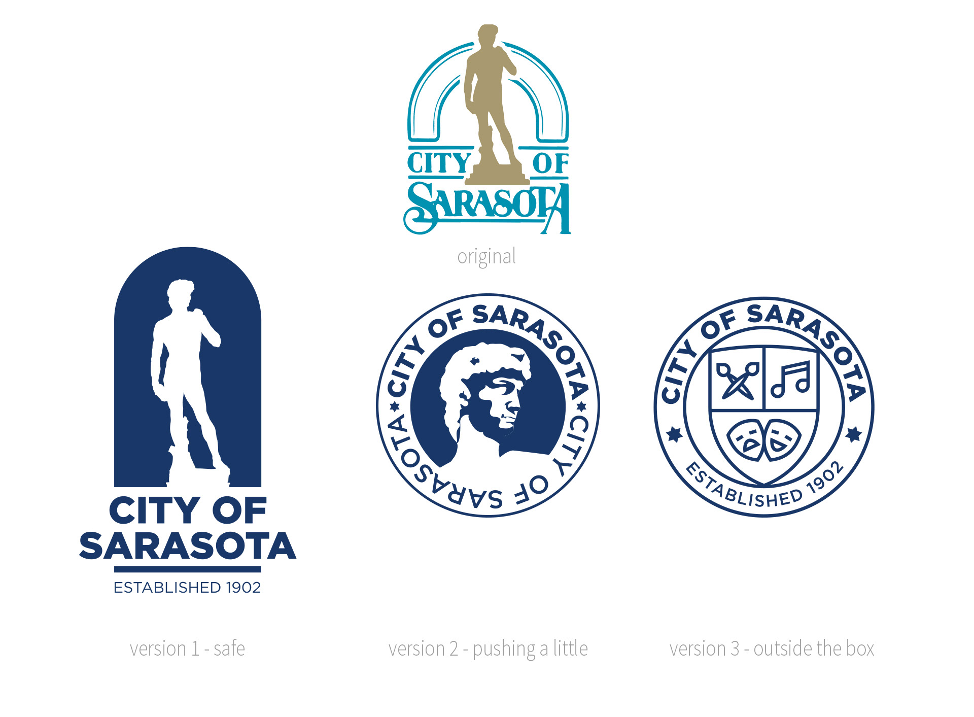
The Statue of David city logo was the next project. The creative brief asked for a 3 presented versions.
1. Keep it similar but clean it up.
2. Present a new take on the David logo
3. Present something completely new.
The local agency did several community poles and it was decided the community liked the old David logo because it represented "the arts" Sarasota is known for.
I have shown the 3 variations below. Final decision is still being made.
Personally, I am not a fan of the Statue of David copy located at the local Ringling Museum as the symbol of the city. Once the two "David" variations were complete I tried to come up with a new take of the logo that still represented "the arts". Something that was more versatile than the statue with more chance for color. The local agency I was working for became quite fond of my new Sarasota crest logo. They had all intentions to push that direction over the David variations.
PROJECT PARTNER
• Work was done for atLarge, Inc., Sarasota, Florida
• Work was done for atLarge, Inc., Sarasota, Florida