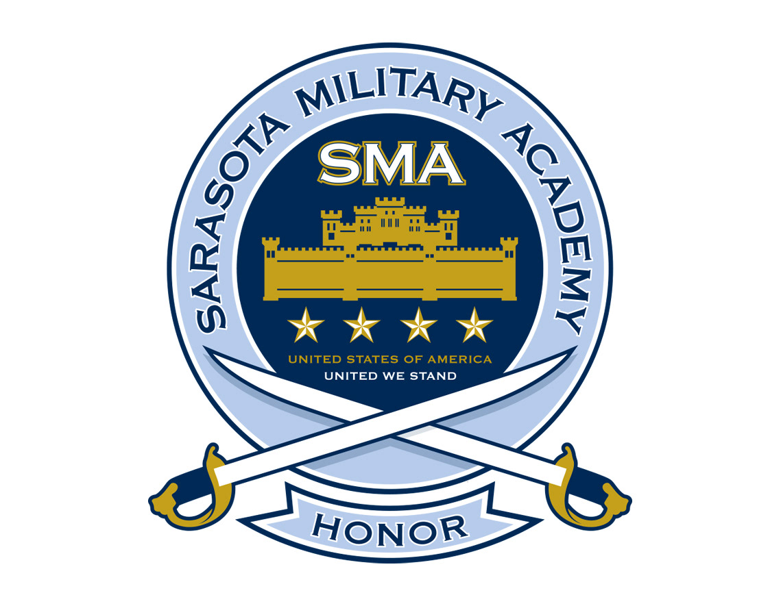
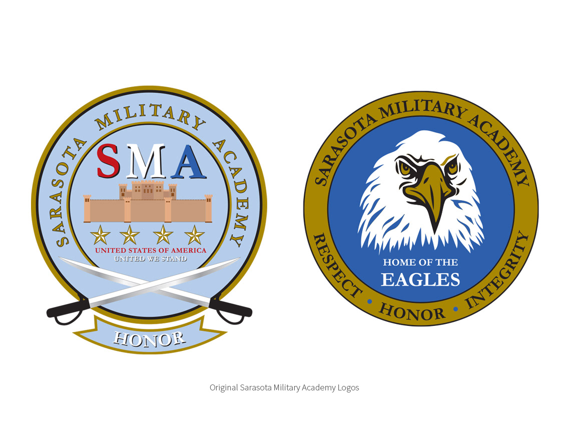
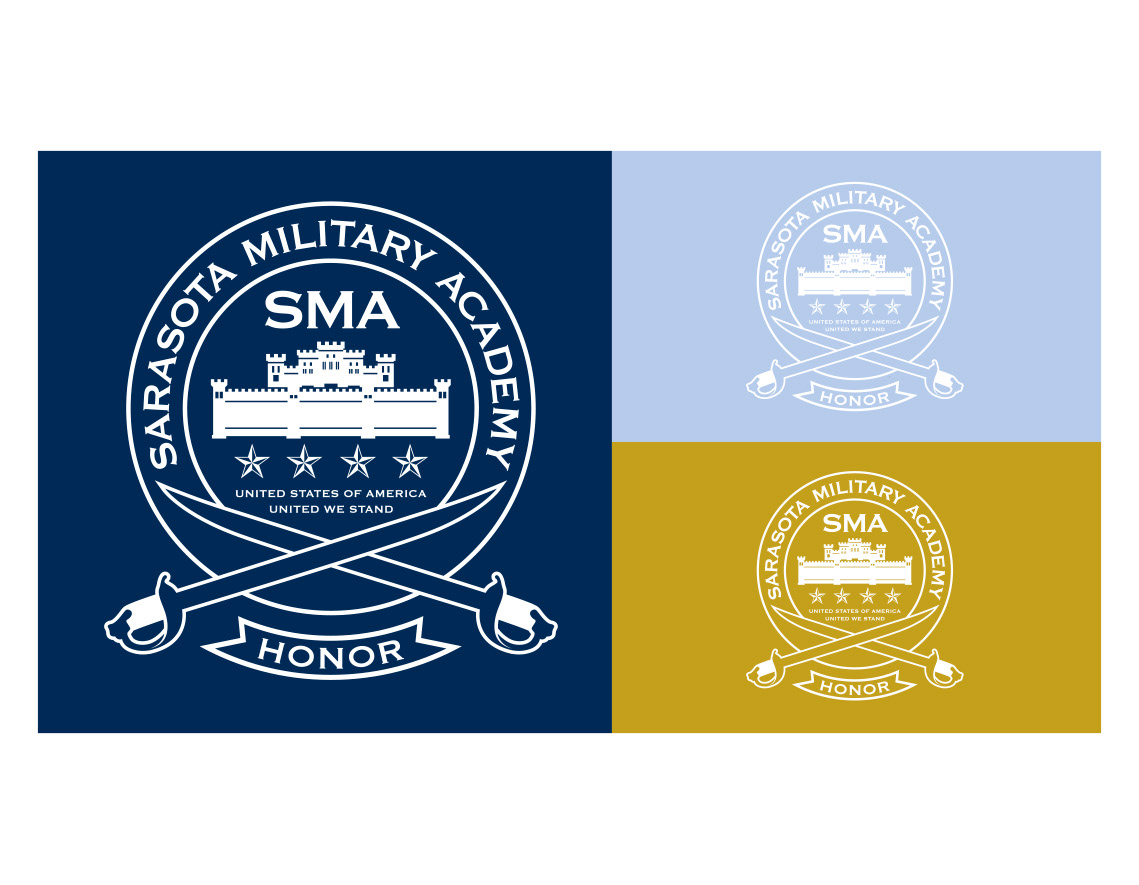
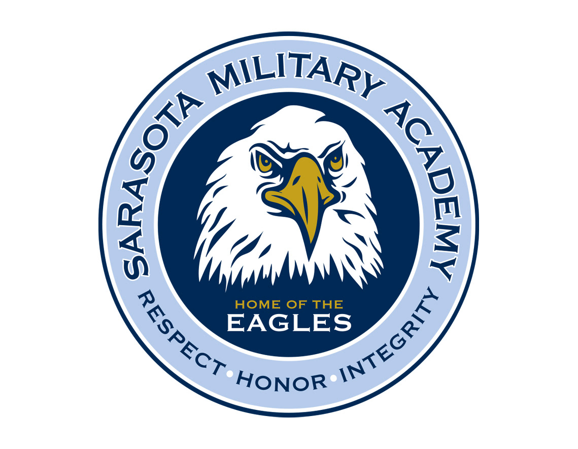
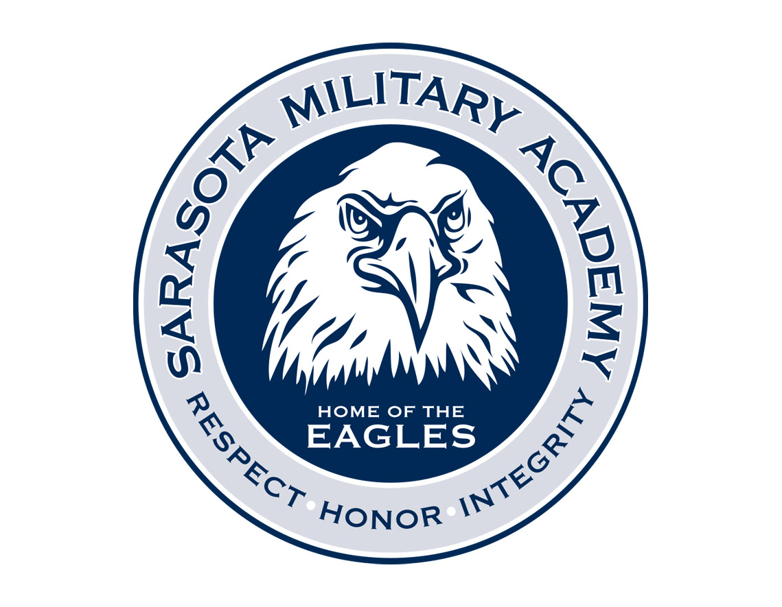
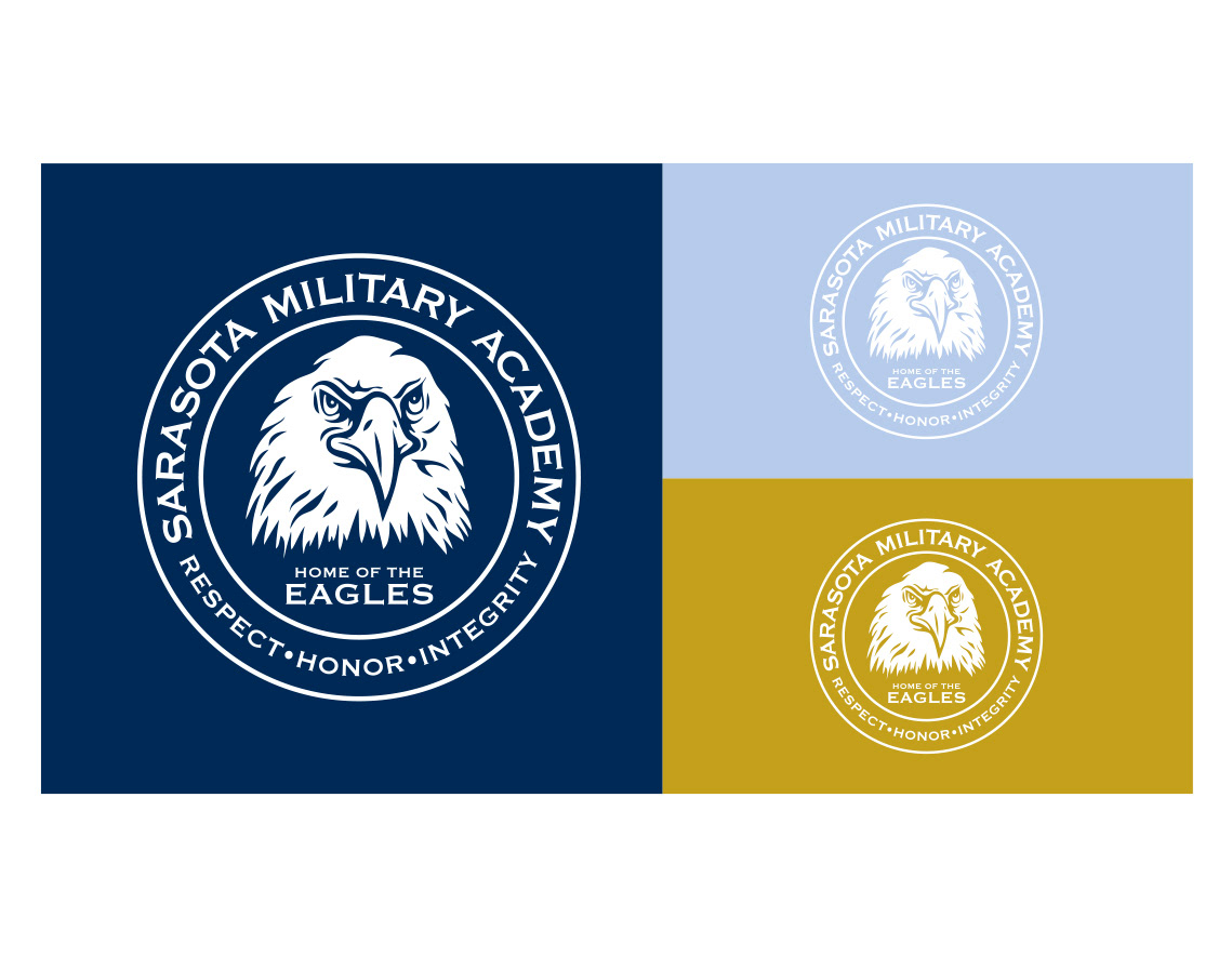
As part of our ongoing relationship with the agency atLarge, Inc., we were asked to refresh the identity for the Sarasota Military Academy. The existing logo was too complicated in it’s graphic illustration of the castle-like building and many of the details were getting lost in reproduction. We cleaned up the look by simplifying the graphic, selecting an easy to read font and better contrasting colors for the emblem. The result has more visual impact and legibility, increasing the overall strength of the brand.
PROJECT PARTNER
• Work was done for atLarge, Inc., Sarasota, Florida
• Work was done for atLarge, Inc., Sarasota, Florida