The city of St. Augustine was looking for a redesign of its tourism and government website and we responded with an innovative approach for the website and a new look for the city’s brand.
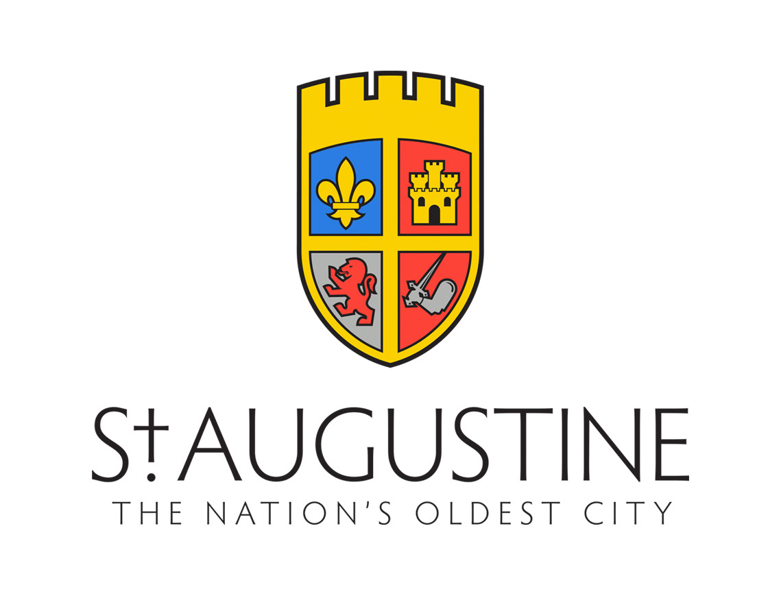
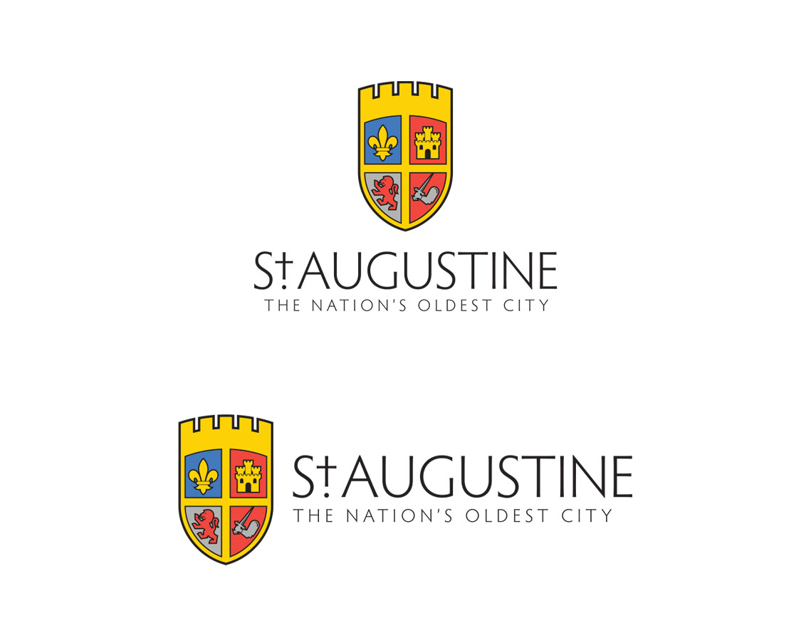
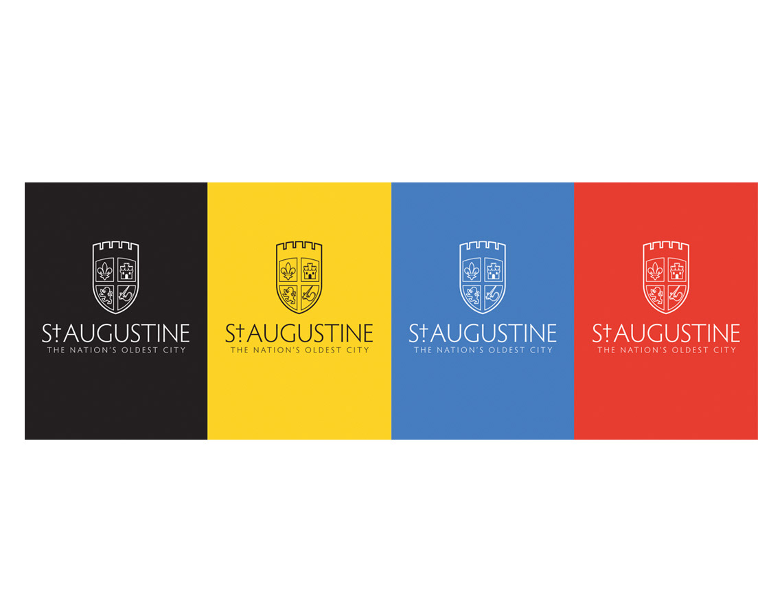
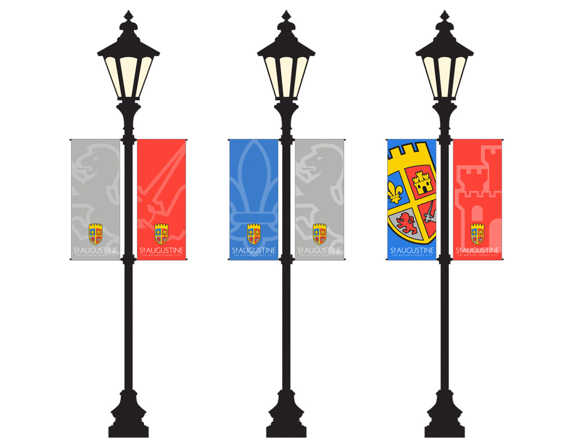
It was important for us to stay true to the history of the city’s crest in our update of the logo, so we kept the original shape but gave it new type, colors, and icons, creating a more contemporary look for a new generation of St. Augustine residents.
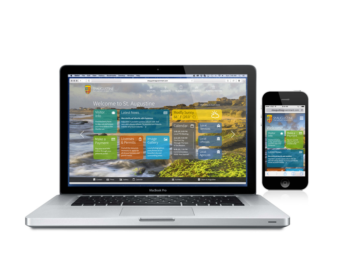
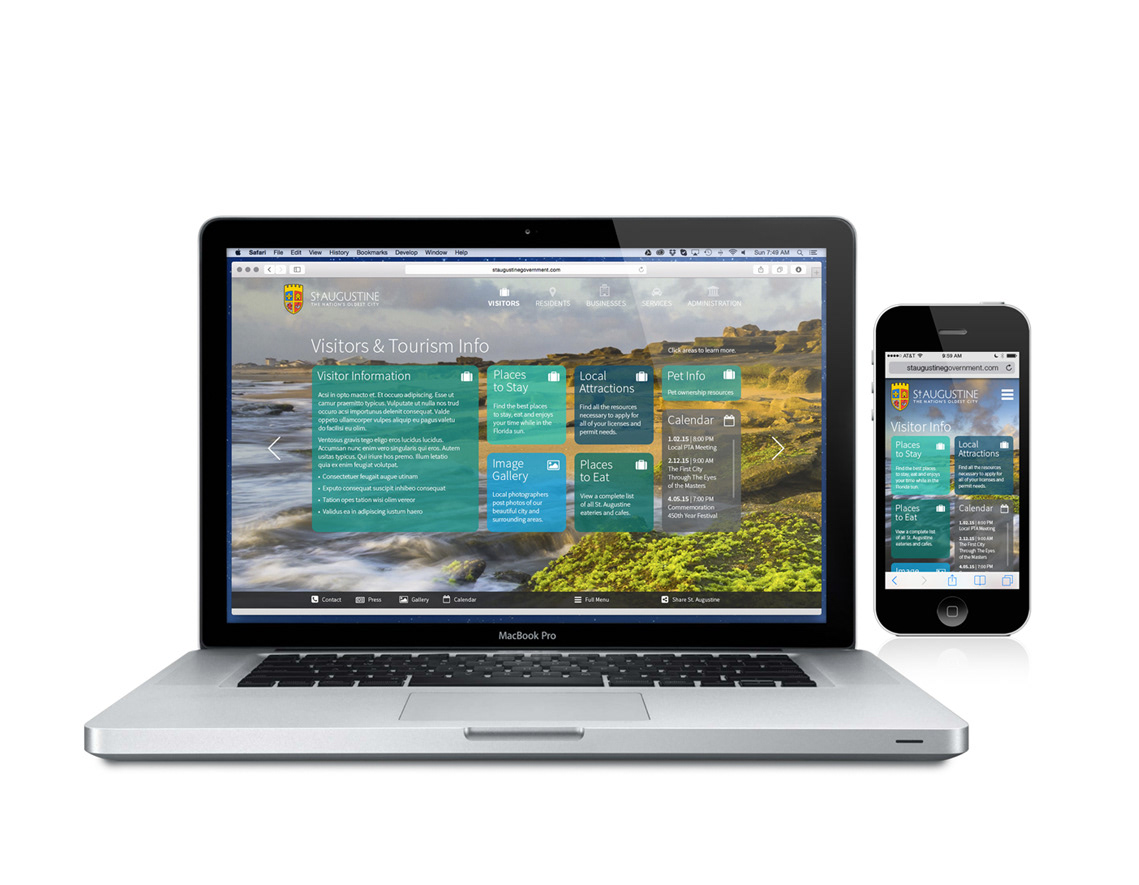
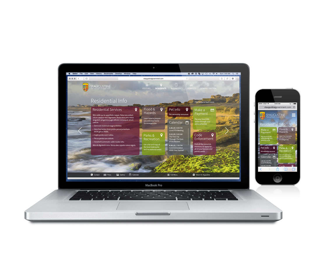
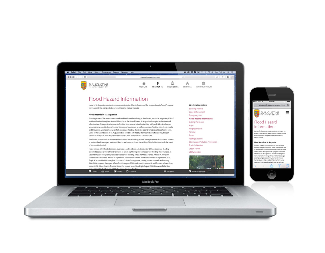
Our website strategy focused on two main areas: functionality across multiple platforms and older browsers; and ease of use for those who may have difficulty navigating online. We combined a fast-loading single image homepage with nav sets of “quick keys” for the most used pages on the site to help visitors find information without being overwhelmed by long lists or multiple pull-downs. Each nav set is color-coded with icons that connect main nav areas with secondary pages for cohesive navigation.