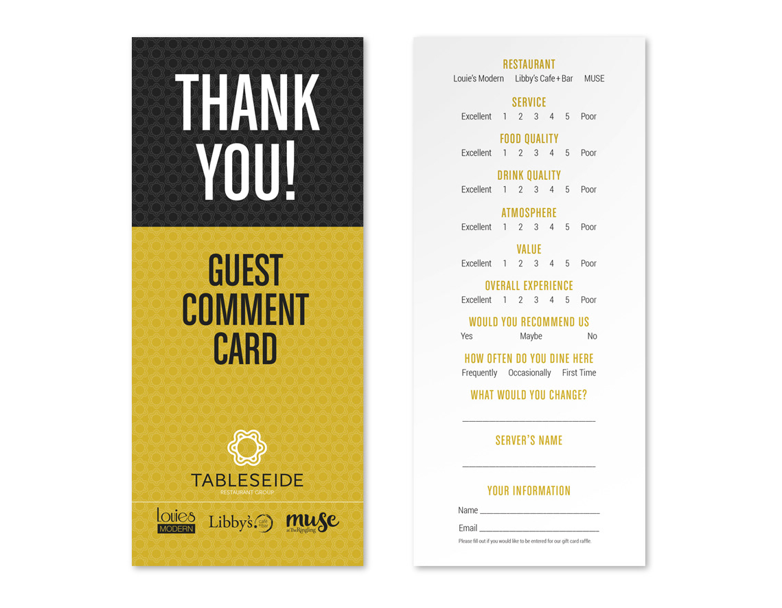
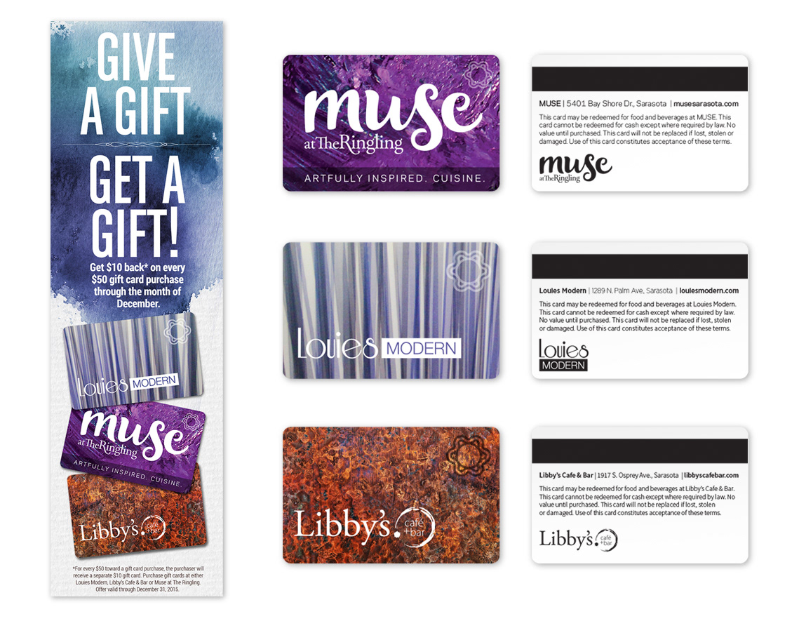
As part of our ongoing relationship with the agency atLarge Inc., we were asked to brand a restaurant group in Sarasota owned by the Seidensticker family. With several successful restaurants already under their name and plans in the works to develop more, they wanted to bring them all together under one brand for better cohesive marketing.
The family name was important to the brand along with a connection to dining. TableSeid was chosen but feedback showed there was confusion about pronunciation, and the dining connection was lost. So we added an “e” to “Seide”. This small change made all the difference. We combined it with a logomark representing a round dining table with chairs. Black and gold were selected as they worked well with all the restaurants logo colors and were strong enough to stand alone or soft enough to blend in as needed. And the repeated mark could be used as a texture for many applications.